The Google Analytics Overview widget presents a trend graph based on the selected key metric from the website's Google Analytics account.
This widget features a variety of color options and can be added to white label Marketing Dashboards, Client Dashboards and PDF Reports. In marketing dashboards you can set it to display at half or full page width. You can view a marketing dashboard sample that contains this and additional widgets (password is demo).
Important! To view this report, Google Analytics must be configured correctly (please refer to our Google Analytics documentation).
- SEO
- Rank Tracker
- Local SEO
- Mobile SEO
- Link Manager
- Landing Pages
- Social Signals
- On-Page Optimization
- Enterprise SEO Solutions
- Marketing
- Competition Analysis
- Insight Graph
- Keyword Research
- Graphs & Widgets
- Market Reach
- Marketing KPI
- Brand Visibility
- White Label SEO
- Marketing Dashboard
- Client Dashboard
- PDF Reports
- PDF Templates
- Other
- Email Notifications
- Portfolio Management
- Integrations
- Google Analytics
- Search Console
- Pay Per Click
- WeDevelop
- API
Google Analytics Overview Widget
Site Traffic(Analytics) > Widgets > Overview
Single Time Period
Users, Sessions, Bounce Rate, Average Time on Site for one time period
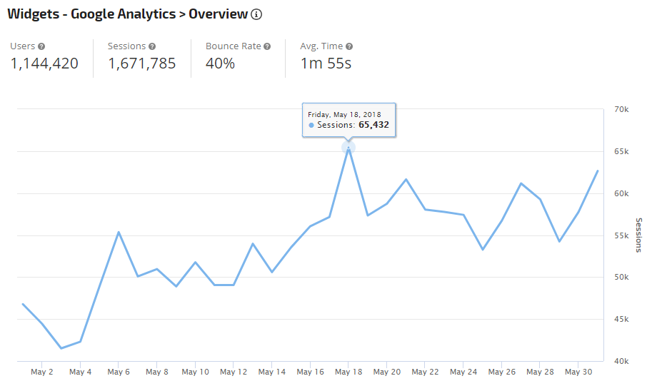
Users, Sessions, Bounce Rate, Average Time on Site for one time period
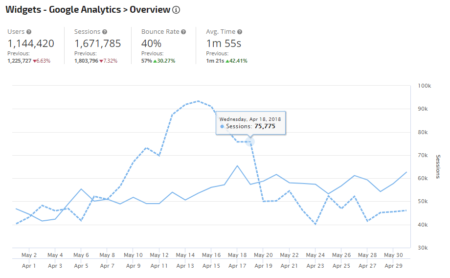
Compare Visitor Trends
By selecting the Compare to Previous Period option in the Date settings, the Overview Widget displays a solid line for the report period and a dotted line for the previous period. If view of the Totals section is enabled, the metrics also include the previous period totals and percentage of change between the report periods.
By selecting the Compare to Previous Period option in the Date settings, the Overview Widget displays a solid line for the report period and a dotted line for the previous period. If view of the Totals section is enabled, the metrics also include the previous period totals and percentage of change between the report periods.
Compare Traffic of Current Period to Same Period Last Year
In the Date settings, selecting Same Time Last Year produces a traffic trend graph with a solid line for the current year and dotted line for previous year. Hovering over any point in the graph provides the number of Key Metric units.
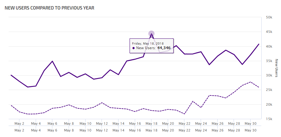
In the Date settings, selecting Same Time Last Year produces a traffic trend graph with a solid line for the current year and dotted line for previous year. Hovering over any point in the graph provides the number of Key Metric units.
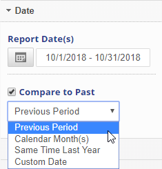 |
Date
|
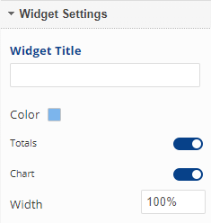 |
Widget Settings
|
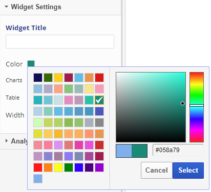 |
Widget Color Settings (optional)
|
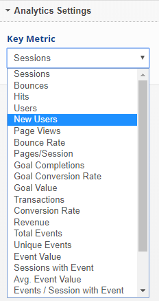 |
Analytics Settings
|
Add to PDF Report
Conveniently add a report or graph with its current settings to a PDF report by hovering over the gold gear icon and selecting Add to PDF Reports
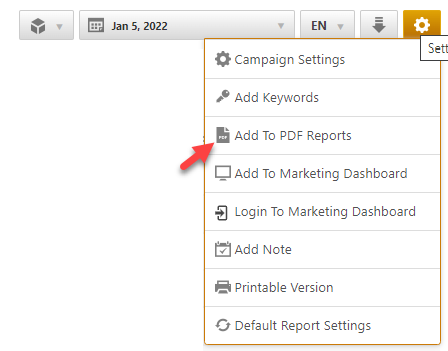
Select the PDF Report that you want the report or graph added to
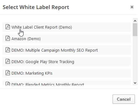
Drag the new report or graph into the position you want it to display in the PDF and confirm that the Date settings do not conflict with the automated scheduling settings.
Add to Marketing Dashboard
Conveniently add a report or graph with its current settings to a marketing dashboard:
1. Hover over the gold gear icon and select Add to Marketing Dashboard
2. Select the Dashboard (campaign name)
3. Select the Dashboard Page that you want the report added to
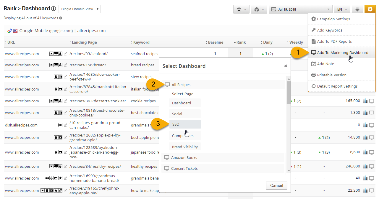
1. Hover over the gold gear icon and select Add to Marketing Dashboard
2. Select the Dashboard (campaign name)
3. Select the Dashboard Page that you want the report added to
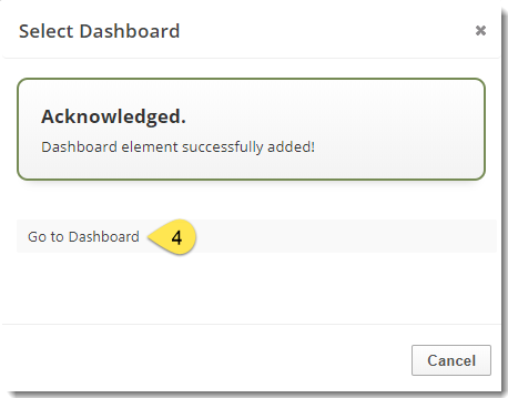
4. Click the "Go to Dashboard" link to further customize the report (e.g., drag it to a specific position on the page, change date settings, etc.)
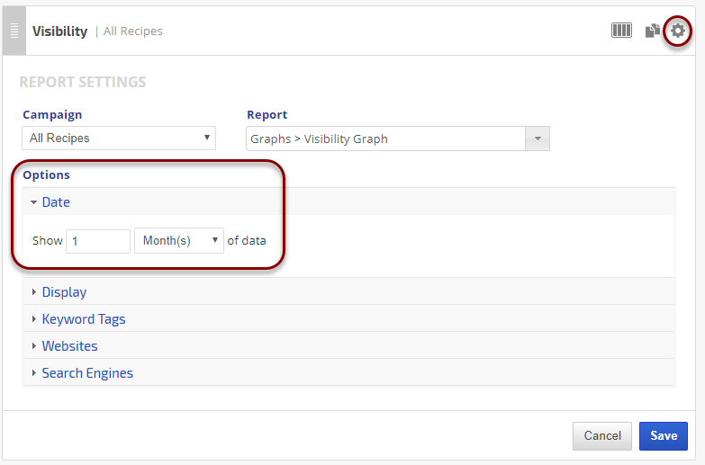
Refer to the Report Options section for details regarding the display settings, filters and sort options available for this report.
The report date (or date range) is governed by the selected Dashboard date option: Date Selection or Fixed Periods, learn more...
- Daily reports default to the last day of the selected period
- Weekly and monthly reports default to 1 month of data
Add to Client Dashboard
Customize Report for Client Dashboard
Client Dashboards display our default report options for each individual report and graph until you modify them. To customize the display of the report, expand the Report Options section, change the settings and click the Apply Changes button.
Then expand Report Options again and hover over the Save icon and select Save as Default for Client Dashboard.
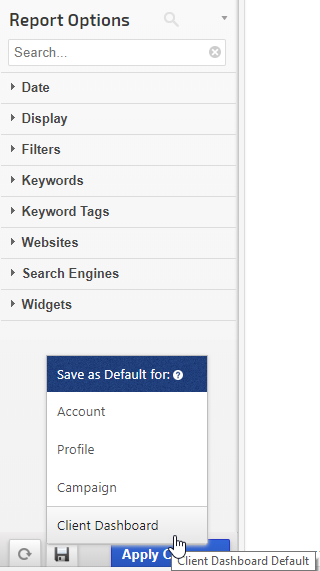
After saving the Client Dashboard default, any changes that you make to the report options will not affect the display in the Client Dashboard unless you overwrite it by following these instructions again.
Client Dashboards display our default report options for each individual report and graph until you modify them. To customize the display of the report, expand the Report Options section, change the settings and click the Apply Changes button.
Then expand Report Options again and hover over the Save icon and select Save as Default for Client Dashboard.
After saving the Client Dashboard default, any changes that you make to the report options will not affect the display in the Client Dashboard unless you overwrite it by following these instructions again.
Enable the Report or Graph to display in the Client Dashboard
Open the Campaign Settings > Client Dashboard screen and check the box corresponding to the report(s) you want displayed in the dashboard, and then click the Save button.
Open the Campaign Settings > Client Dashboard screen and check the box corresponding to the report(s) you want displayed in the dashboard, and then click the Save button.
Refer to Client Dashboard Settings documentation for additional instructions for customizing your dashboard.